A COLOR SCHEME THAT MARRIES BOTH OLD AND NEW
- May 18, 2023
- 5 min read
Updated: Feb 6
BLENDING TIMELESS CHARM AND EASY LIVING: A HOME REMODEL and Tribute to honor my mother.
I’ve included my "How to Get Your Color Correct the First Time Checklist" and sources at the end of this post so you can also get the look.

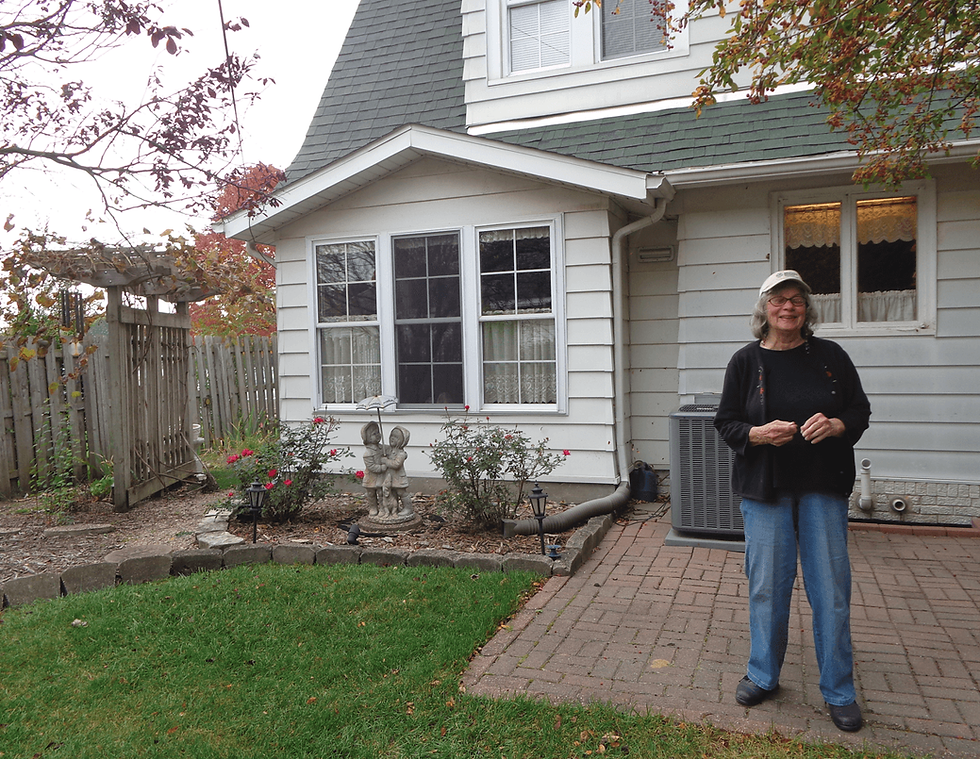
My mother's home, built in 1918 with stunning views of the river, was dark, dated and dead in the real estate market when we inherited it. So after my mother's long battle with Alzheimer's disease and cancer, the idea of REVIVING her OLD HOME as a steward of my mother's legacy and my lament, was a wise decision.
But, MARRYING OLD AND NEW in a way that looks harmonious and balanced is both an art and skill and I wanted to avoid the pitfalls of bad planning and wasteful trendy decor decisions that I see in most Real Estate Listings. Gutting the home and starting with all new trendy finishes would be easier than carefully considering what stays and goes and creating a cohesive plan, but this was my mother's beloved home waiting for a new family to restore it so that it could restore them.
I knew this renovation was being done for resale and needed to invent a fresh neutral color scheme to appeal to new homeowners, breathe life into a dark space and pull it together cohesively. The priorities were maximize return on investment while honoring the charm & integrity of the architecture, exterior views and memory of my mother who was a Master Gardener. I knew I wanted a "nurtured by nature" color scheme that paid homage to the home’s history and river views and highlighted the architectural details while simultaneously feeling fresh, light and airy.
When you are renovating or updating a space, the process for choosing the best foundational color scheme that plays nicely with the existing finishes, pulls it all together beautifully and breathes new life into an old space can be challenging. Combining dark earthy colors from glories past with the fresh colors of today, can be difficult and if done without consideration can result in a muddy mess instead of a refreshing respite. I've seen many updated and renovated older homes that have turned out looking more like Frankenstein's piece-mealed bride. And choosing the wrong paint color is a very expensive and stressful mistake to make and can cost thousands of dollars to correct. I've learned from experience, that It’s far easier, in fact critical, to spend a little time and money up front and know for sure that the color you have worked so hard to ensure is right.
The first step is to determine what is staying and what is going in order to give this kitchen and the entire home a fresh, new look that combines both soul and substance and would appeal to a broader market. With a myriad of living spaces within the main living areas, I had quite a few hues to analyze, hone and curate so I broke out my trusted paint color deck and carefully selected a simple, yet classic, scheme that elevated the home’s wow factor while honoring its heritage.
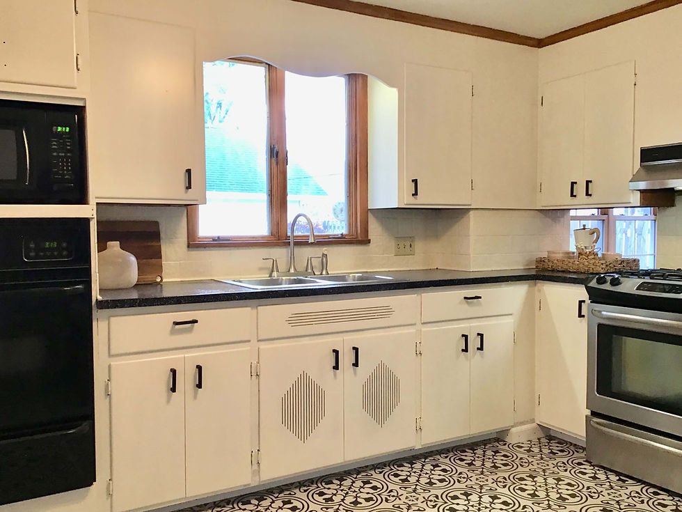
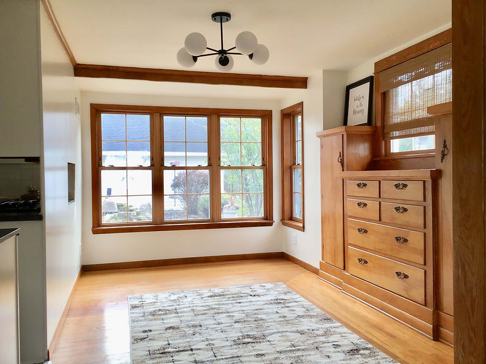
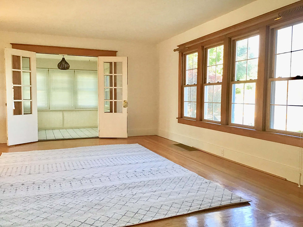
Before photos:


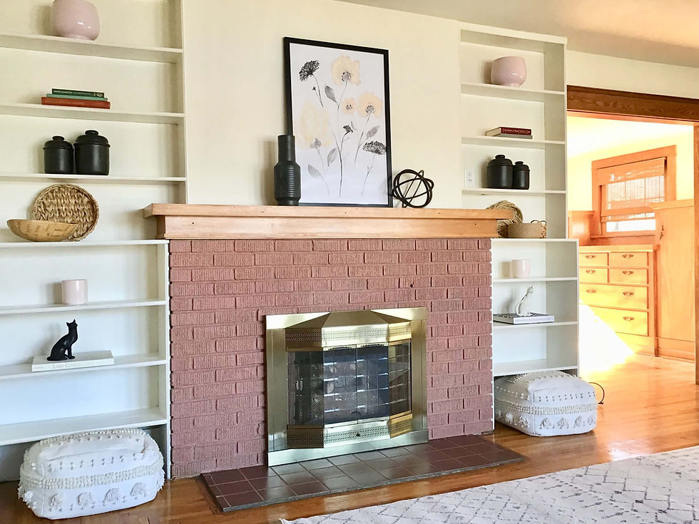
The 2-story home featured the original brick fireplace, oak hardwood floors, trim and charming built in custom cabinetry in the dining room (with original hardware) that was still in good condition, grounded the space but the colors throughout the home made it feel old and out of touch and the kitchen felt dark, dingy and sucked the life out of what should have been a happy place as you can see above.
The new generation of home ownership longs for a light and airy space but marrying fresh clean color with heavily muted brown & beige isn't easy or intuitive. But I was inspired one late Summer evening while standing in the living room looking out at the river, and was able to translate that vibe into a cleaner, unifying nuanced earthy palette of browns and grays, blues, and persimmony barely there neutrals that suits the memory of my mom, holds hands with the remaining fixed elements, creates flow throughout the entire home and transformed her faded interior into a fresh haven and peaceful nest for the next generation.
Using my large paint samples, I tested my favorite white, off white, complex cream, greige and beige paint options from my library of hundreds of large paint samples. Benjamin Moore's Swiss Coffee was used as the foundational neutral in the main level rooms with cooler lighting and Benjamin Moore's Pale Oak was used as the foundational neutral in the main level rooms with warmer lighting.
We’re happy with the finished look, and apparently so were house hunters as the home was sold over list price, in a bidding war within hours of listing.
The home now beautifully blends the character of “old soul” with "savvy steward".
Here are the paint colors with links I chose to refresh this home and honor my mother's legacy of gardening and giving.
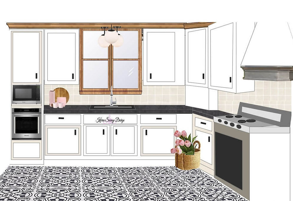
Kitchen: OC-45 Swiss Coffee
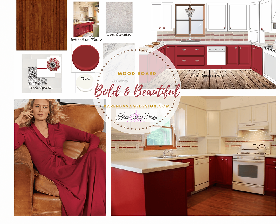
Here is the Kitchen's Design Concept to prove cohesion, best idea and facilitate design decisions:
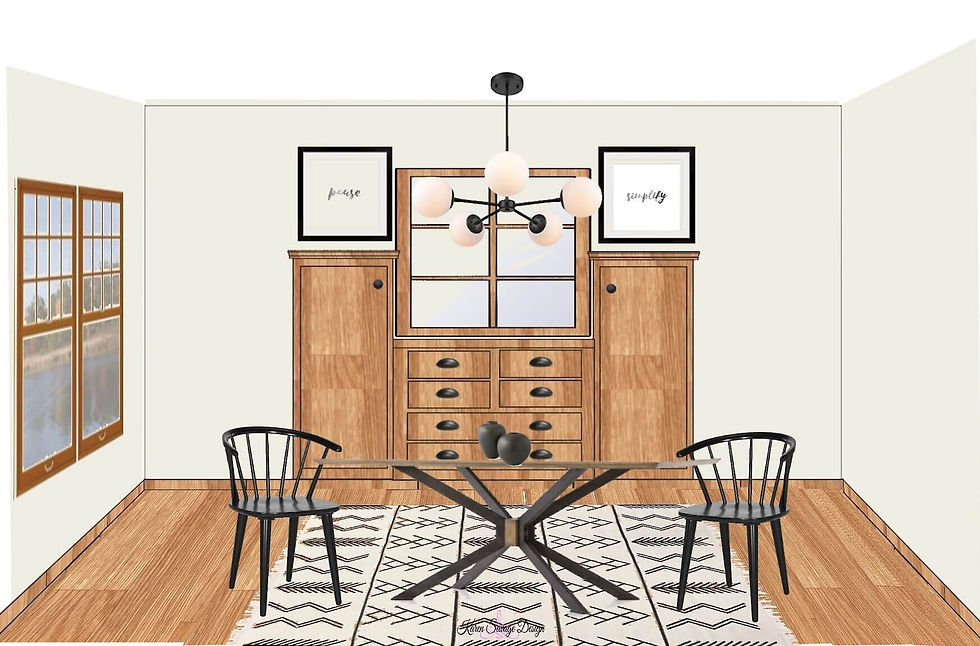
Dining Room: OC-45 Swiss Coffee
Here is the Dining Room's Design Concept to help the new homeowner envision the new look and test before they invest:
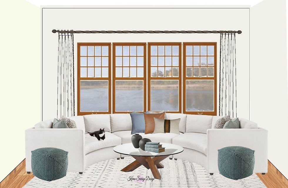
Living Room: OC-20 Pale Oak
Here is the Living Room's Design Concept for testing before investing:

and the other wall in the Living Room:
Here is the Living Room Design Concept for the living room showing the new homeowner how to finish the space:
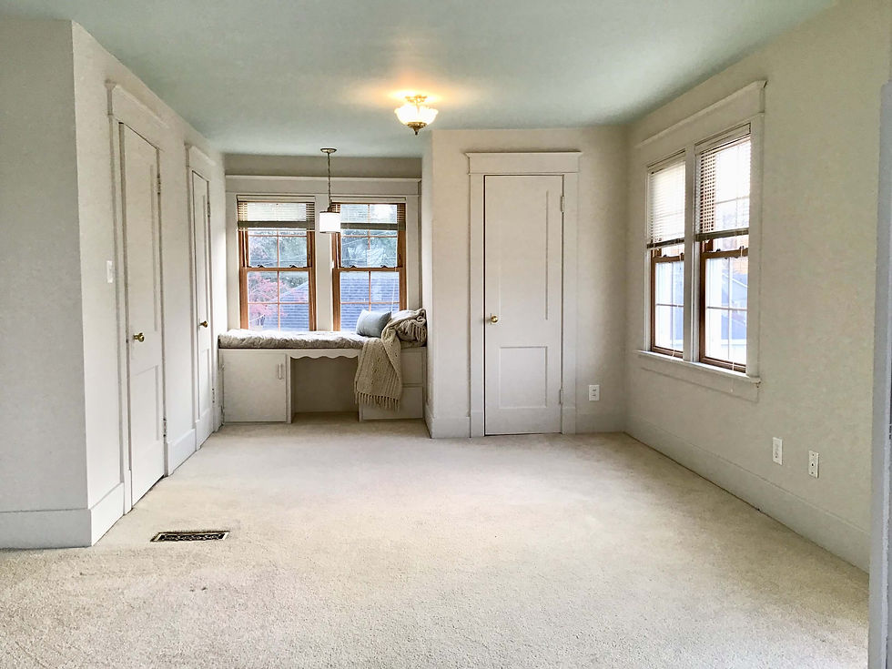
Bedroom: HC-173 Edgecomb Gray on walls and trim, Ceiling: HC-144 Palladian blue
Staircase, Hallway Walls & Entry: HC-34 Wilmington Tan

Exterior Mudroom Door: HC-60 Queen Anne Pink, Interior Basement Door: 1603 Graphite, Mudroom Walls: OC-45 Swiss Coffee

Color Scheme Tips to Pull it Together (your how to get your color correct the first time checklist)

If you need assistance with any of the steps above, contact me for more assistance.

Ready to Breathe New Life Into Your Old Space without regret & frustrations?
Imagine being thrilled knowing that your kitchen and home could be completely updated with simple finish updates while avoiding the typical DIY design mistakes that can cost you time and money.
How would it feel knowing you hit your remodel goals while avoiding the pitfalls of bad planning and wasteful trendy design decisions?
Sometimes being a good steward of God's resources means honoring the past so we can honor the future.
I think my mother would approve.
If you're Looking for help getting started on your refresh, renovation or furnishings project without unwanted surprises so you can steward your resources well (aka: save time, save money on mistakes and empower you to make wise design decisions), contact me today.

p.s. Is your mom (or mom surrogate) still living, nurturing & inspiring you? Remind her how much she is loved and admired by giving her a hug today.


Comments